Flexible Forms
Cognito Forms is an online form builder that allows its users to drag and drop fields on a canvas and, without needing to code, create sophisticated forms that can collect data in smart ways. The form is hosted at a Cognito URL as well as available to be embedded on any website. See an example Cognito Form here.
Cognito got its start in 2013 and five years later the technology it was built on was dated and the technical debt of the codebase was due. So we went about rebuilding it from the ground up.
A Complete Refactor
Being responsible for the UI, my goal was to recreate the various existing form components on newer and better-structured code without reinventing the wheel. However, I was able to also include countless small (and sometimes big) improvements along the way.
Component Library
The dev team decided to use Vue in the refactor. When weighing the options the simplicity of Vue tipped the scales in its favor. Our forms support a lot of different field types, each with complex requirements, so unavoidably we have a whole lot of code. Using Vue allowed us to manage this complexity.
Settling on Vue, we then shopped around for an open source component library to use as a jumping off point. Element.io suited our needs best. We eventually forked it so we could truly make it our own.
Theming
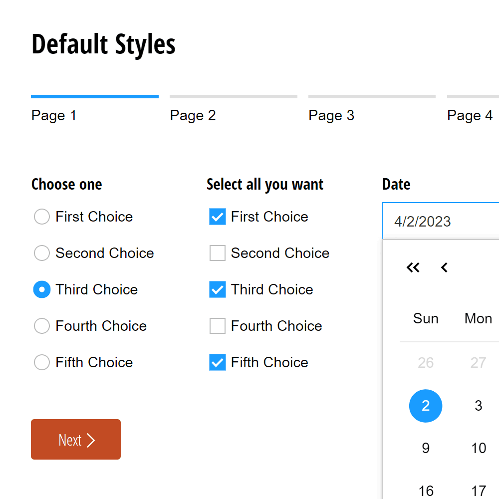
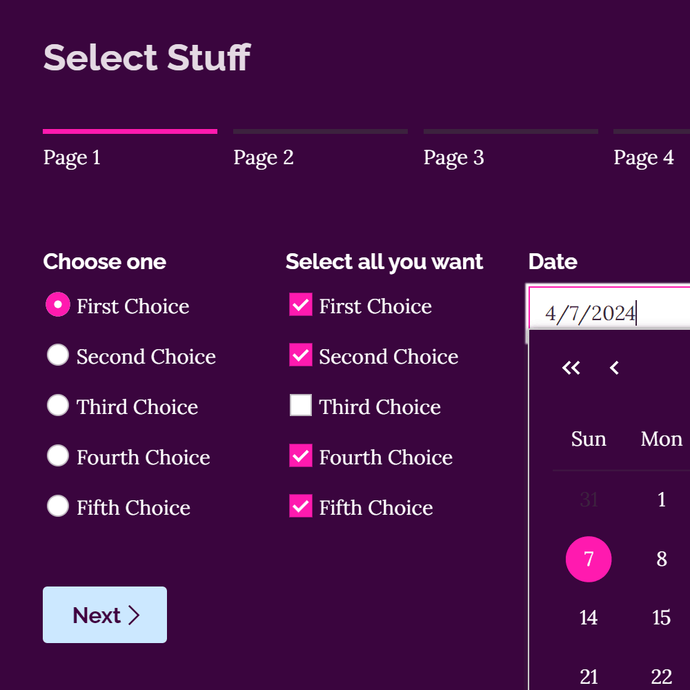
Cognito Forms allows its users to customize the look of forms they create in a simple style editor. What can’t be styled in this editor can probably be tweaked with CSS.
Early on I decided I wanted to use CSS custom properties for more flexibility. For example, by changing one spacing variable the breathing room of all elements on the form are adjusted. One variable adjusts the relative speed of all animations. The style editor doesn’t leverage all of these variables, but that is just a simple matter of adding on to the UI. In the meantime, customers can easily tweak these variables if they’re handy with CSS.
Custom Icons
Like so many other products of the era, Cognito's forms used FontAwesome for icons. It was important to me to upgrade to a custom icon set to stand out from the crowd. By the time our refactoring started in 2018, SVGs had become the standard format for icons. I was happy to use them because they're great for so many reasons, but for this project two benefits really stood out. Adding an icon was now as easy as adding a new SVG file—no adding on to a font file. Also, with this change form builders can now tweak the weight of their form's icons with a CSS variable.
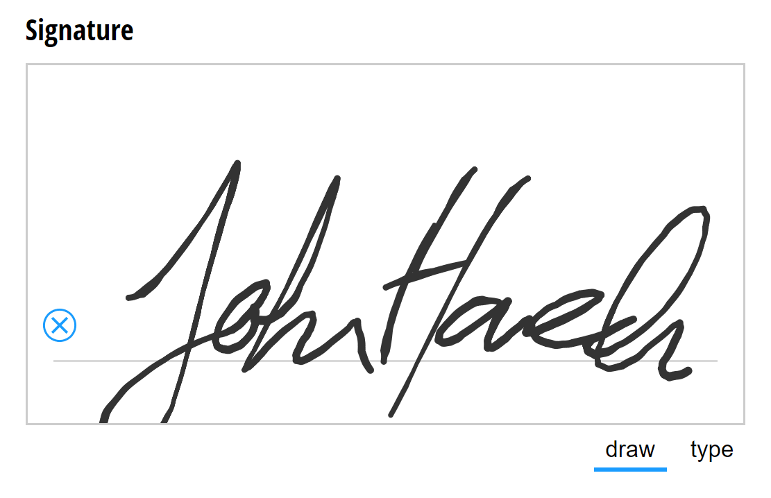
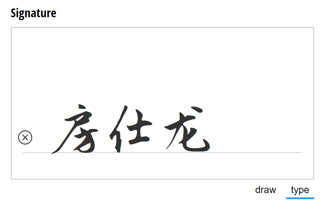
Accessibility and Signatures
Easy to use forms are good for everybody, but some customers really need their forms to pass certain accessibility standards. I worked hard to ensure user's forms would meet the WCAG 2 AA guidelines. One big obstacle to this goal was our signature field. It was impossible to fill out without a mouse or a touchscreen—keyboard-only users were unable to submit the form if the signature was required. This refactor was my opportunity to expand our accessibility to include this last problem field. Today, a keyboard user can tab to the “type” toggle button and type out a signature in a typeface almost guaranteed to be better than their own cursive.
Responsive Forms
When building forms on our platform users might not always have every device size in mind, but that doesn't mean their forms shouldn't look great on all of them. Customers of Cognito Forms love how much flexibility they have when laying out their fields—fields can be laid side to side in as many as 8 columns. But this flexibility is another factor that must be considered when ensuring a good responsive experience. Since we don't know how users will lay out their forms or where they'll embed them, each individual field has to detect if it's running out of space and respond accordingly.
A Happy Customer
We have a form that’s seven pages long and was originally designed for the PC screen thinking that’s where people would be doing the online version of the application. About 70% of people are using this incredibly complicated form on their phone. And it just works. It just works.
UX Testing
With each change to the UI came an opportunity to impact users' experience. To validate the changes were all for the better, I created a long form which included the components we had some uncertainty about and arranged for several remote test users to complete the form. Some aspects did confuse some of these users in small but important ways and we were able to improve usability by addressing their problems.
One example of a problem we were able to easily fix had to do with the combobox, a field which allows the user to pick an option from a dropdown list or to write in another response if it isn't listed. The visual clues that inputing text was possible were too subtle for some users. After weighing the video evidence we determined that the down chevron icon indicating a dropdown list was overpowering the flashing text cursor indicating the text was editable. So we removed the chevron icon when arbitrary text was allowed.
Final Thoughts
Every day lots of work gets done all around the world on interfaces built out of building blocks I helped create. When I reflect on that, I’m very proud of my role on this project. Also, my experience working on this system gave me an appreciation for how complex seemingly simple systems can be. It was fun to be knee-deep in that complexity and solve interrelated problems throughout this project.