A Design System
Cognito Forms is an online form builder that allows its users to create sophisticated forms that collect data in smart ways—without knowing how to code.
In many cases, the capabilities of the product had caught up with and surpassed its competitors but the look and feel still lagged in sophistication. The time for an overhaul of the visual design of Cognito Forms had come.
So that we could deliver a fresh website to people shopping for a form builder as soon as possible, we split the project into two phases. The first phase was to develop a design system and redesign the unauthenticated portion of the website, used for marketing and support content. The second phase was to bring this new design system to the app itself.
Collaboration
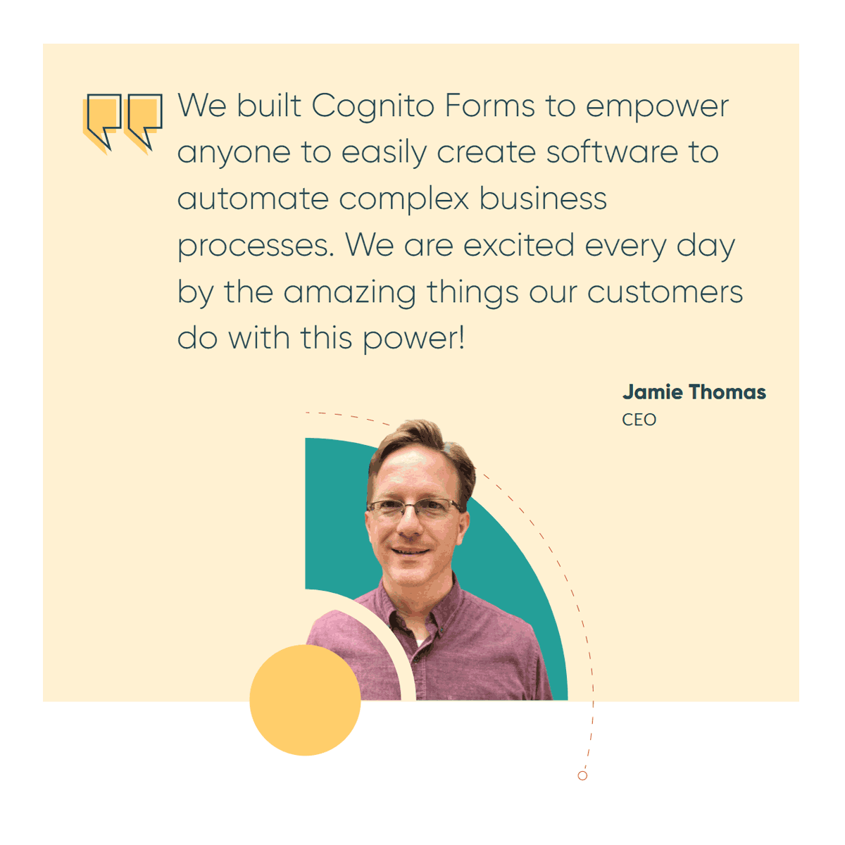
I led a team of two other talented designers. We had very recently started working remotely because of COVID-19, but that didn’t interfere with our communication at all. I’m really proud of how our team gelled and how collaborative we were able to be during this project. I’m also thankful for tools like Figma that enabled seamless communication. I became a huge fan of Figma during this time.
We’d meet regularly to discuss what we wanted out of our new design system and we did plenty of research and discussed the strengths and weaknesses of other systems. Because I’m very conscious of the fact that sparks of inspiration rarely come by committee, I asked for team members to work on quick mini-projects that we would later critique as a group.
In this environment of idea sharing, we developed two very different proto-design systems. One that featured 3D cartoonish form componants as literal building blocks, and a sleeker, flat system which featured circular elements orbiting around a single point of interest. I think both ideas had legs and could have been developed into great systems, but the business goal was to evoke sophistication and in that light, the system with flat, concentric elements was the right choice.

Concentric Design System
Color
Going into this project the Cognito Forms brand was fun and colorful. Though the watchword for the redesign was “sophistication”, we retained many of the strong colors associated with our existing brand but used them in more restrained ways to achieve a fresh look while not severing that link to our past. We gradually expanded the palette as we realized an addition was needed for visual appeal or accessibility.
Iconography
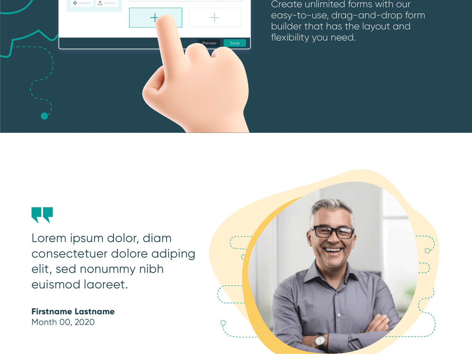
We greatly simplified the illustrative style in Concentric. Previously, the illustrations were often intricate objects which stood in metaphorically for features of the product. In the redesign we streamlined illustrations to simple flat line drawings on top of a splash of secondary color. While this style is a lot sleeker, it avoids becoming staid by giving the designer the freedom to dial up the funk with color.


Concentric Orbits
The cog is a key part of the Cognito Forms brand. In the Concentric system, cogs, circles, and circle-fragments orbit around a focal point in the design. In print material, the orbiting relies on ones imagination, but on the web, the circular elements rotate like clockwork as the page scrolls.
Typography
Everything revolves around circles in Concentric. When a circle won’t do, sharp edges are preferred for a stark geometric look. This is carried forward with the beautiful geometric typeface which we use for headings, Gilroy. We use Lato for smaller text.
New Logo
Before creating a new logo, we had already often resorted to replacing it with a C in a cog in its place. The complexity of the old logo necessitated this. Similar to how we retained many colors from before Concentric, we also decided to keep the "Cogicon", as we call it, after refining its shape.
Implementation
At Cognito Forms, the design team is also in charge of UI development. The process of converting Figma designs to web pages allowed us to continue to refine Concentric as we made tiny decisions in every corner of the website. For example, we tweaked colors here and there to ensure enough contrast to meet WCAG 2.0.
Previously we had converted the website to Vue. When converting to Vue we also switched to using a custom-made CSS utility class library inspired by Tailwind. Between Vue and these utility classes, the dev process was a joy.
Rotation
Because the Concentric orbits are ubiquitous on the site, I wanted to enable designers to easily create a variety of arrangements and to seamlessly go back and forth between Figma and code. The orbit of the elements required us to make adjustments we couldn’t always plan for in Figma.
With some simple JavaScript and a few utility classes, elements automatically orbit on scroll. The speed and/or rotation direction can be modified by adjusting the Figma layer name which comes through as a class name on the SVG element.
Final Thoughts
We saw our year-over-year conversion rate grow by 68.5% in the first month after we rolled out this newly designed website. However, we didn't rest on our laurels—the new design system still wasn't in place for the app itself. The yet-to-be-written part of this story is how we expanded Concentric to the app UI used by thousands for building forms and managing data.